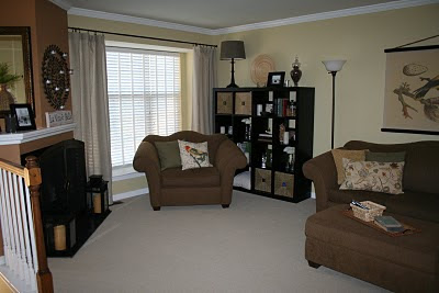
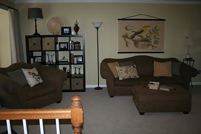
Funny how you can see a room every single day, but not really see it till you look at photos.
So, what's wrong with this picture?
1. Huge empty wall.
2. Shelves above oversized chair are way too small.
3. Too many bird pillows.
4. Wrong prints for us.
5. End table not really our style.
So I got to work on correcting these problems.
I kept one bird pillow and exchanged the others for some variety.
I returned the prints and found the bird canvas at the Pottery Barn outlet that I absolutely love.
Then I tried filling in some of the empty space by decorating under the end table.
I figured that would do til I could get rid of the coffee table. It was a hand me down and worked for us for several years, but just isn't our style.
But, then the hubby and I decided to just go ahead and finish this room. We spend the bulk of our time at home in this room and we were so close to being done. So we took an impromptu trip to Ikea Friday night in search of an Expedit piece. It took care of the end table problem and the too-small-shelves issue all at once! We went with the brown/black color that has a wood grain look to it. I think it blends nicely with the other furniture in the room.
What a difference adding this piece made! (please indulge me while I share a ton of pics!)
The baskets in the Expedit also came from Ikea. They are the Knipsa ones. They fit perfectly and are a great way to store some of my son's toys in the living room without them being seen. (The small peek at a blue toy can be seen in the pic, but not in person.)
The large wooden plate on top is the Hutlet dish from Ikea. The glass vases are the Snartig vases also from Ikea on clearance for 80 cents each! I love the texture on them. I filled them with large white flowers from the grocery store for only $4.
The lamp was from the end table, and I got a new drum shaped lamp shade for it form Target in burlap. It goes great with the natural linen drapes.
Everything else in this piece was re-purposed form other places in the house.A great way to fill it up and de-clutter other areas at the same time! I love the look of all the candles (battery operated) lit up in there at night.
With the end table gone, we wanted to be sure to have something we could set a drink on if need be, but no longer had room for anything large and/or bulky. We found the perfect solution at Pier 1: the Perry Pedestal. We placed it on the other end of the couch, opposite of the Expedit. I re-purposed an orchid (since I ended up with one too many for behind the fireplace screen) and a little birdie, which I placed on top of some of my vintage hardback books from my great aunt and my Mamaw.
I am in LURVE with our living room now! It so much cozier. We have one more little thing to do in here (a new light fixture in the entrance area) but other than that, this room is DONE!
(Disclaimer: yes, the front of our front door is blue. We can't change the color of it due to association rules. The blue looks totally out of place when the door open like that, but I love having the door open to let in all the beautiful sunshine! And the blue actually looks very nice with the rest of the house on the outside.)
Thanks for sharing this journey with me as I added finishing touches to our living room!
This post is part of "Make Your Monday" at Twice Remembered.


8 comments:
That is so true! I have noticed that too. You look at a room and don't notice, but then you see the photo and go, "Oh. So that's how it looks," or "so that's why it doesn't feel right." I love the expedit!! It made a HUGE difference and it is so artfully arranged.
You did a fabulous job!
Hi Jessi! You see so much more in the photos, don't you? I love the big bird banner, and the way you accessorized your shelves. I battle with hiding toys, too. :)
Looks fab! Your little birdy pillow caught my eye....to cute and I love the pop of color.
Happy Monday to ya!
Kendra “Domestic Princess in Training”
Wow! I love how the shelves filled in the space. I did like the idea of using the basket under the table, too. Nice job! It looks great :)
I got your message about meeting us in Lanc. I tried to find your email address, when you get a chance send either of us an email and when we get the details, I'll email them to you! I am so glad you can make it! I think there is a total of 7 of us so far :)
Wendy
I really really want one of those book shelves! Your's looks soooooo great!
Allison @ http://www.houseofhepworths.com/
You did a good job. I like the shelves a lot.
Way to go...looking at your room objectively, and going about changing to what you wanted, systematically! Looks great!
Isn't it amazing the new perspective taking a photograph can give you? The updates to your living room look great!
Post a Comment